
Project Overview
About
Habitual.ly is a responsive web application that helps Millennials achieve their health related goals by building healthy habits using the platform's data-driven insights, curated health & wellbeing content and access to health & wellbeing providers.
The Challenge
We live in a digital age where everything is connected and virtual. The problem with this “always-on” lifestyle is that many people are suffering from burnout. Add to that the stresses of work and life in general, and it’s no wonder many people struggle to stay on top of their health needs or conditions.
To help address this, as part of the CareerFoundry UX program, I was given the following brief:
Allow health-conscious individuals to log in to a responsive health and wellbeing portal to record their health and medical information, and access general physical and mental wellbeing features.
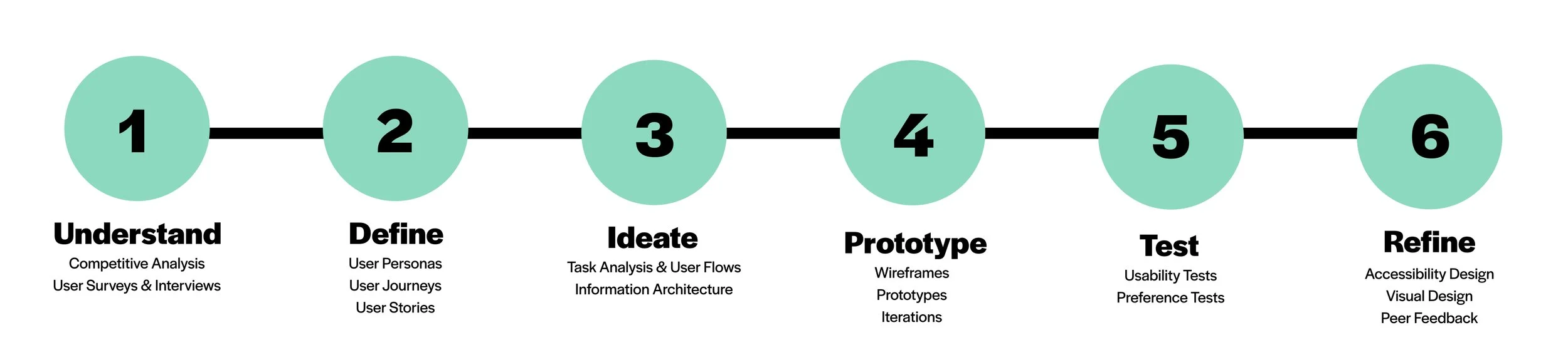
The Process
-
My Role
UX/ UI Designer - end to end product design
-
Project Time
9 Months
-
Tools
OptimalSort | Adobe XD | Figma | Draw.io | Miro | Helio
Understand
Industry Research
Given that there are a great many aspects to health and wellbeing and ‘health-conscious individuals’ is not specific enough of an audience, my first step was to identify an area and groups of users to focus on. I was inspired to focus on mental health due to the increasing attention on declining mental health during the Covid-19 pandemic, and as I had come across this statistic:
"mental and behavioural disorders account for approximately 7.4% of the global burden of disease and represent the leading cause of disability worldwide" (source).
Covid-19 has only exacerbated the issue and to my surprise, has greatly impacted Millennials - the proportion of adults aged 25-34 years old experiencing severe psychological distress increased from 11.5% to 18% between Feb 2017 and April 2020 (source). So, it comes as no surprise that the Deloitte survey also shows Millennials now rank mental health in the top two areas they are prioritizing in their lives.
“44% of millennials said they feel anxious or stressed all or most of the time.”
— 2020 Deloitte Global Millenial Survey
I wanted to understand and fill the gaps in existing health & wellbeing technology offerings by designing a responsive platform that helps Millennials better manage their mental health.
Initial Problem Statement
Health conscious millennials need a way to access tools that will help them better manage their mental health because they are experiencing high levels of stress, anxiety and burnout in their 'always-on' lifestyle.
We will know this to be true when we see how many millennials are managing all aspects of their health and wellbeing through the platform.
Initial Hypothesis
A platform that provides a more streamlined and simplified way for health conscious millennials to manage their mental health via holistic health tracking and management capabilities in addition to educational content on improving their health and wellbeing. The platform will follow security best practices to ensure user data is secure and will provide users with full control over use of their data. The experience will be tailored to the user's current state of health (with a focus on mental health) and their health goals and the interface will be easy to use and responsive to ensure they can quickly access what they need, when they need it.
Competitive Analysis - ‘WellTech’
With my initial problem statement and hypothesis in mind, I set out to understand what was on offer in the 'WellTech' space.
It is a very competitive space, predominantly made up of products that focus on a particular area of health (e.g. nutrition, fitness, mental health), however, there are still products that aim to provide more holistic health management. In addition to a general analysis of the market, I chose to also conduct an analysis on two platforms that promote themselves as offering ‘all-in-one health management’ (Care Clinic and Healthily) and an appointment booking platform.


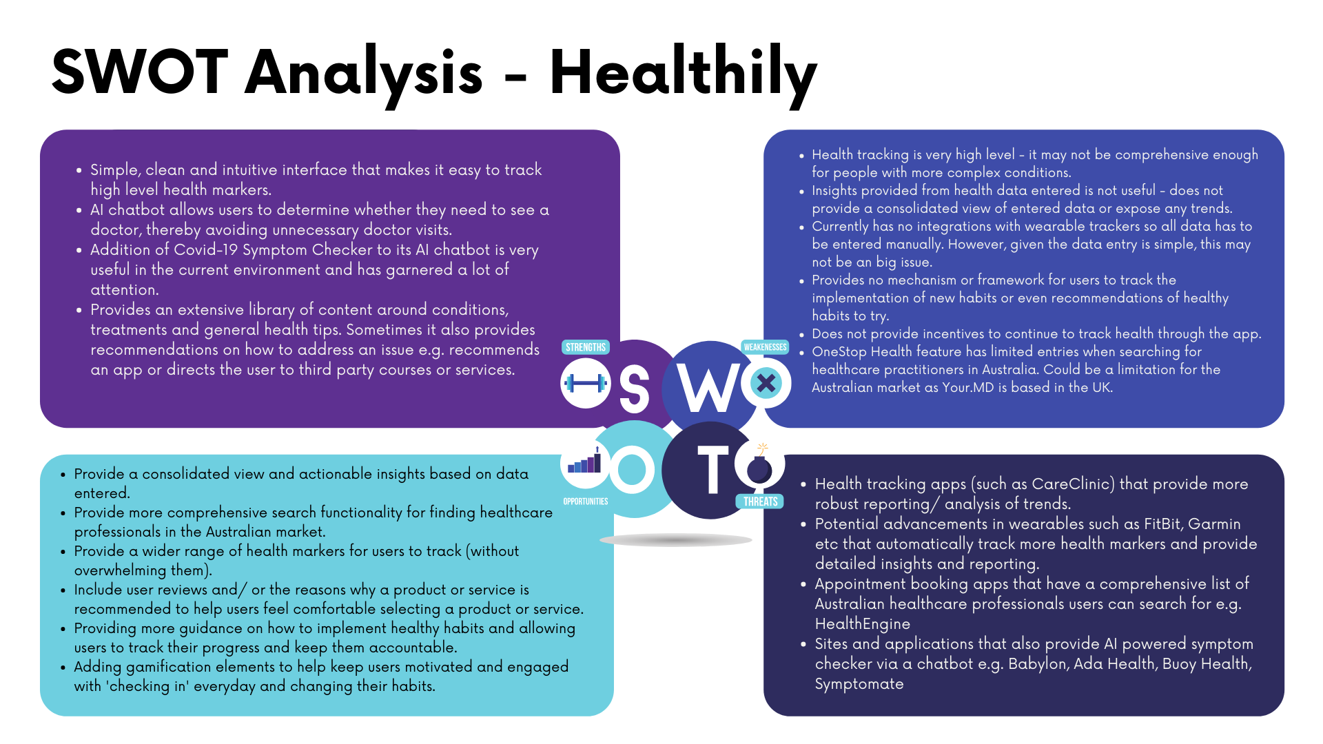
Key Insights
-
#1 No focus on habits
None of the platforms provided a framework for developing & tracking healthy habits. Some also did not provide any educational content around habits.
-
#2 Manual data entry
A few required a large amount of manual data entry for the app to provide useful insights. They did not have integrations with health/ fitness trackers or only integrated with Google Fit and Apple Health.
-
#3 Insights/ Reports are not useful
Some of the apps provided a wealth of tracking, insights and reports, however, it was quite overwhelming and it wasn’t clear how they should be used for improvement.
-
#4 No Gamification
None of the platforms had any gamification elements to help keep users engaged and motivated.
-
#5 Lack of Australian Healthcare Providers
Very few health management apps have an Australian database of healthcare providers/ services for booking appointments.
User Research
To understand the needs, goals, motivations, behaviours and frustrations of my target users, I conducted a survey and user interviews.
I started with an anonymous survey to get initial insights into the general attitudes Millennials have towards their health and wellbeing and to determine what areas I want to explore further in the user interviews. I then conducted in-person and remote user interviews to gain a deeper understanding of the goals and challenges Millennials have relating to their health and wellbeing.
To synthesize and analyse the data from both the surveys and the interviews, I conducted an affinity mapping exercise.

Survey
Goals
Understand the health and wellbeing goals of Millennials and what the biggest barrier to achieving those goals are.
Identify what type of tools/ products Millennials are using to manage their health and wellbeing and how effective they feel these tools/ products have been.Determine the comfort levels of Millennials with storing their health/ medical information in a platform and sharing this information with their chosen healthcare professionals.
Identify what I should explore further in my user interviews.

User Interviews
Based on the insights from the survey, I identified the areas I wanted to explore further in the user interviews.
Goals
What types of health and wellbeing goals Millennials are undertaking and the challenges they encounter trying to achieve them.
What kinds of tools millennials are currently using, the context in which they are using them and how effective they have been in helping them reach their health and wellbeing goals.
What causes millennials to lose, increase and maintain their motivation to continue working towards their health and wellness goals.
Learn about their opinions and experiences with telehealth.

Affinity Mapping
To analyse the data I conducted an affinity mapping exercise, which yielded the following key insights.
What I Learnt
-
#1 Healthy Habits is key
Participants view developing healthy habits across exercise, diet and sleep to improve all aspects of their health as the most critical activity, which also will set them up for further improvements in specific areas.
-
#2 It’s not about the tool, it’s how you use it
While most participants use a mix of digital and offline tools to work towards their goals, a common complaint across all tools is a lack of accountability or needing to do a lot of manual data entry.
-
#3 Missing Motivation
Maintaining motivation is a critical barrier to achieving their goals, with the most common cause of a loss of motivation being changes in their schedule disrupting their routines.
-
#4 Simplify
The most common way for participants to get back on track is to simplify their life by only focusing on a couple of things until those things become a habit again.
-
#5 Data
Millennials are open to storing their health data on a platform, but it depends upon what type of information is stored, how secure the platform is, how it is used and who can access it.
-
#6 It's difficult making time to see healthcare professionals
The interviews revealed that while Millennials find advice from healthcare professionals as critical to their success, they often find it difficult to make the time.
However, both the survey and the interviews showed that Millennials are very open to telehealth due to its convenience and in fact believe it would increase their likelihood of seeing a healthcare professional.
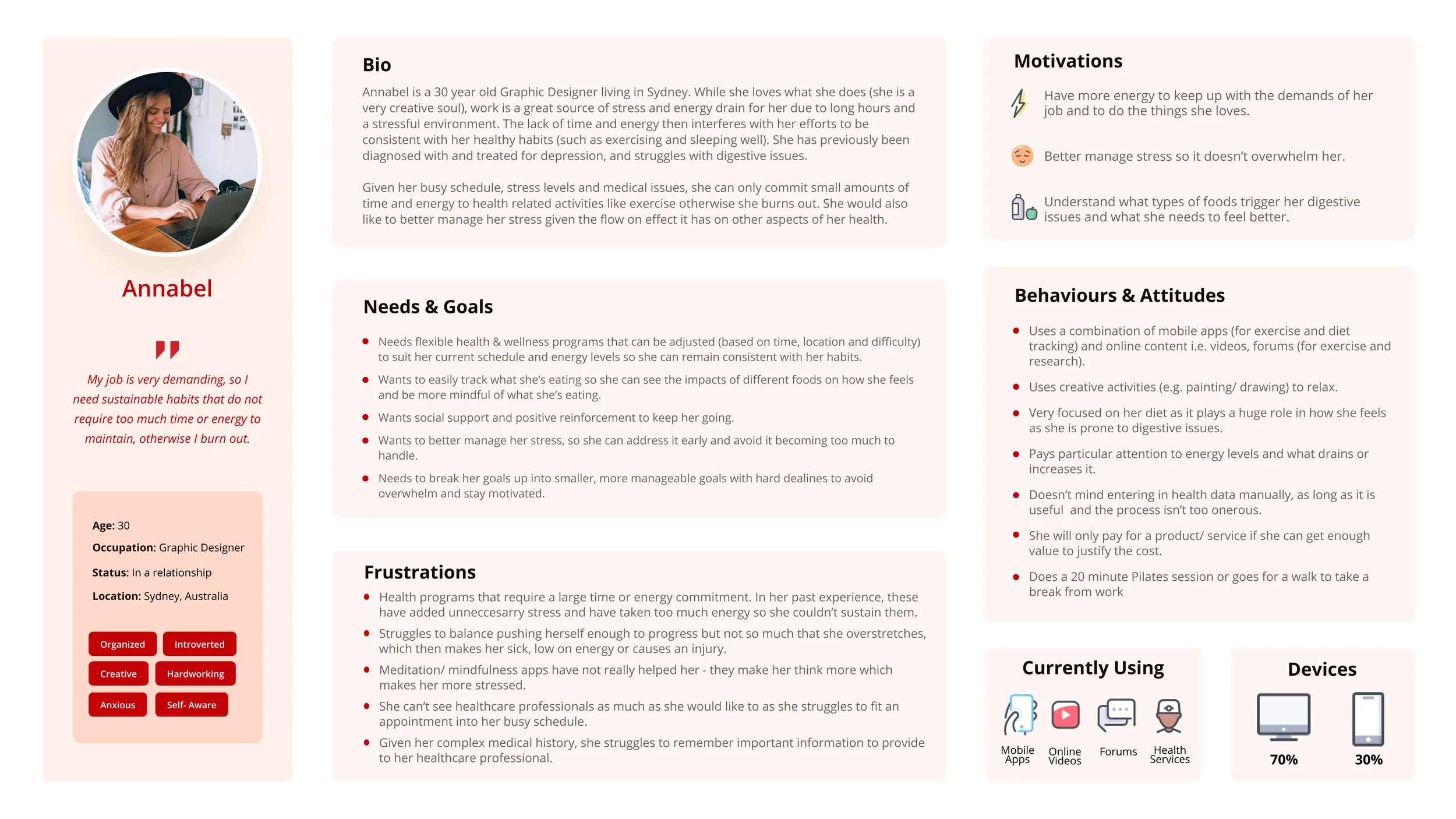
Define
User Personas
Using the insights gathered from my affinity mapping exercise, I developed 3 user personas - Annabel, Steven and Dan to help establish empathy with the target users and to help prioritise functionality.


Features Required - Brainstorm
Based on the User Personas I brainstormed the potential features and functionality I would need the platform to have, which I would then need to refine and prioritise:
Easily log meals (reduce amount of manual entry)
Easily search for health and wellbeing content including workouts & recipes using a variety of filters
Book a telehealth appointment with a healthcare provider
Social accountability
Guidance on how to set achievable goals and effective habits
Share health data with healthcare professionals
Recommendations/ feedback on their progress and what they can do to improve their chance of success.
Key Decision
The insights I gathered from both the affinity map and the user personas revealed that overall Millennials were in fact more interested in developing healthy habits to improve their health generally, rather than having a specific focus on improving their mental health. Certainly, mental health was still a top priority for them (along with fitness and weight loss), but many believed that it's more critical to focus on establishing good habits across exercise, diet and sleep as this would already improve all aspects of their health and set them up for further improvements in specific areas.
As a result, my original problem statement needed to be revised to reflect the insights I gathered from my user research.
Initial Problem Statement
Health conscious millennials need a way to access tools that will help them better manage their mental health because they are experiencing high levels of stress, anxiety and burnout in their 'always-on' lifestyle.
Revised Problem Statement
Health conscious millennials need a way to establish and maintain healthy habits that help improve their overall health because a good foundation of health will help them achieve goals in other areas of their lives.
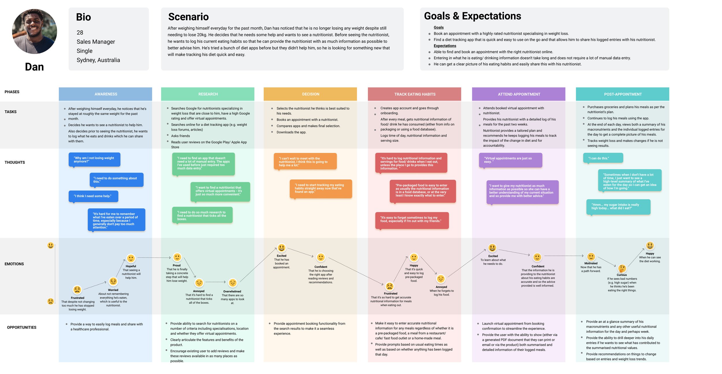
User Journeys
With the user personas defined, I identified key goals of each user persona and the high-level steps they would follow to achieve that goal. I then proceeded to visualise this process using user journeys.
The key goals I identified and selected to prioritise for the launch of the app were:
Define goals and habits
Book an appointment with a health professional.
Log meals
Search for a workout
I selected these as they are the foundation of the app - other features would rely on the outputs of the above to be implemented. Additionally, if these features are done right they will already have a significant impact.

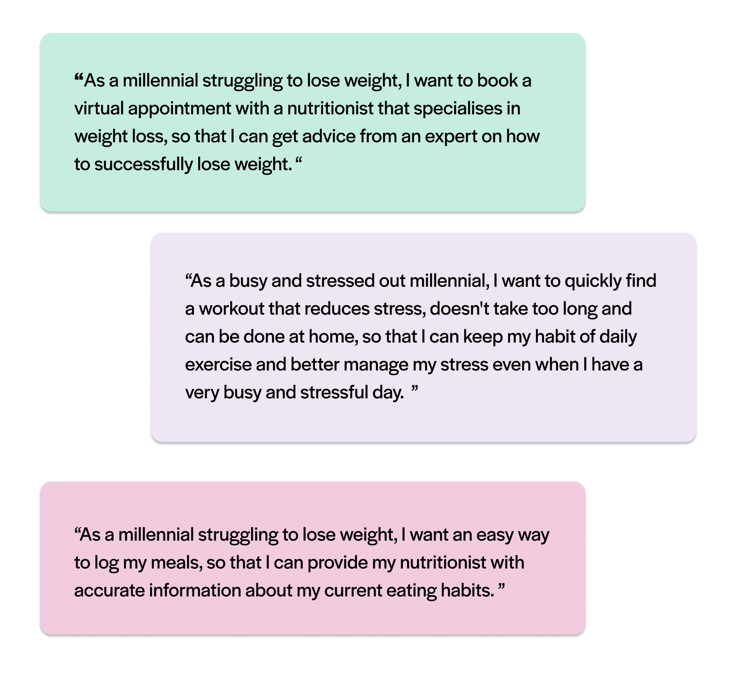
User Stories
With the user personas and user journeys complete and my prioritised features selected, I could use the insights gained to create user stories to help map out the tasks my target users would be completing.
Ideate
User Flows
With a solid set of personas and an understanding of possible scenarios and goals, it was time to determine what screens/ pages I would need to include in my design that would help the user achieve their goals.
Using the user stories as a starting point, I proceeded to walk myself through all of the individual steps needed to complete the objective to determine the task flow. With task flows completed for each objective, I could then visualise not only the linear path but also any possible deviations or alternate paths the user could take while navigating through the platform to achieve their task, using user flows.


Information Architecture

I used the insights gained from the competitive analysis, user journeys and user flows to create an initial sitemap for Habitual.ly.
I conducted an online card sort using OptimalSort with 7 users from my target segment with the following goals in mind:
Validate my existing categorisation and naming for the second level in my sitemap.
To validate the naming of the first level in my sitemap, ensuring it makes sense to users.
My analysis of the results produced a number of insights that required changes to the sitemap.

Findings & Revised Sitemap
#1 Renamed "Practitioner Profile" to "Practitioner Details" - to make it more obvious that it is relating to a health professional's details, rather than anything to do with the user's profile.
#2 Share Health Data - Moved to 'My Settings' to specify the default settings for this feature and renamed it to 'Share Health Data Settings'.
#3 Added 'Favourites' to My Profile - to provide a consolidated view of favourites (i.e. combine favourites from 'My Library' and 'Favourite Practitioners').
#4 Moved Health Record to be under 'My Profile' - To reflect the categorisation that seems to make the most sense for participants.
Prototype
Wireframes
Using the finalised sitemaps and user flows, I created some basic sketches for both mobile and desktop to flesh out the navigation and basic layout for the prioritised functionality:
Onboarding
Search for a workout
Book an appointment with a health professional
Log a meal
With the navigation, core structure and functionality sketched out, I could now focus on refining the layout - namely the basic placement of UI elements through mid-fidelity wireframes.
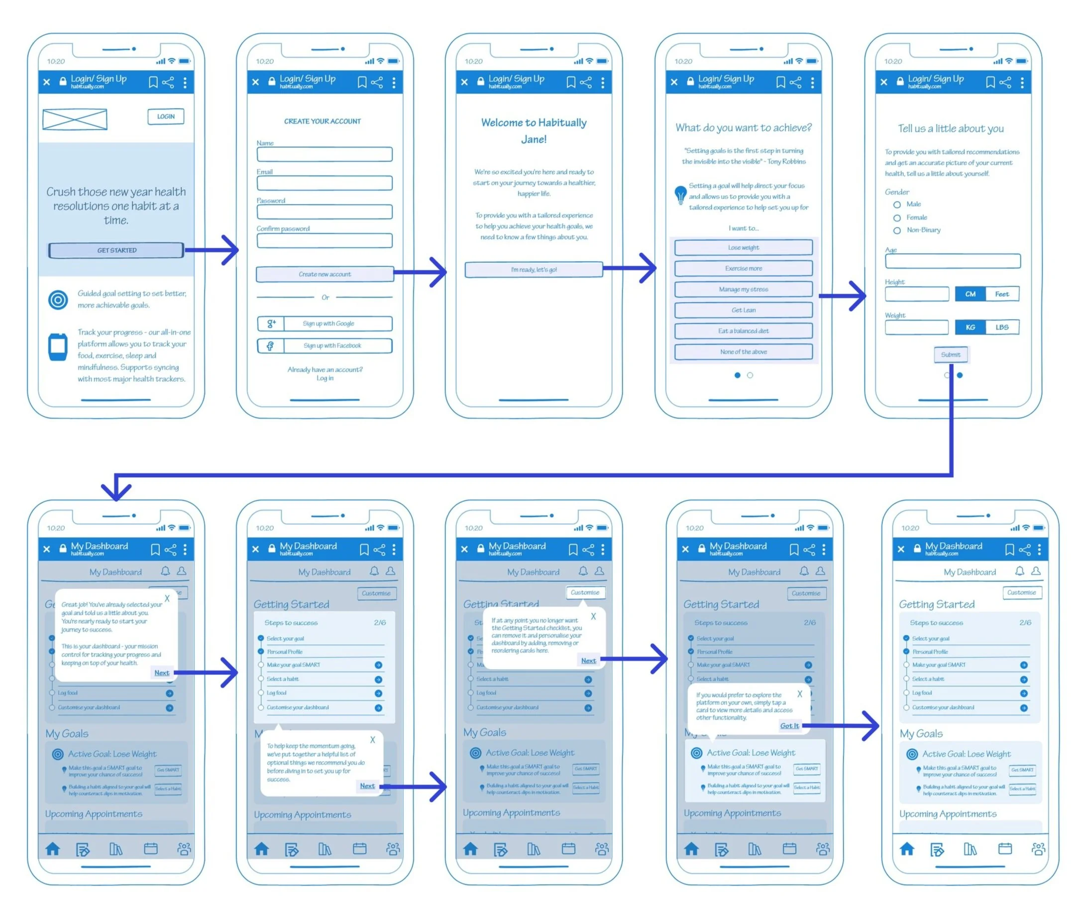
Onboarding
Key Design Points:
Progressive onboarding: Given there are a lot of features in the app, I decided not to display a tutorial for everything straight after onboarding. Instead, as they access features for the first time, they would be presented with a walkthrough, which is always skippable as well.
Personalising the experience based on selected goal & personal info: I also wanted to help users stay focused on their goals by providing guidance on what the next steps are based on their goals as well as the info they provide (e.g. gender, age & calculated BMI). The intention is to personalise recommendations for content, tips and tasks in the app that are related to their goals and where they are at rather than generic content.

Appointment Booking
Key Design Points
Finding a healthcare provider that’s right for me: Among some of the insights gathered from user research, was that not only is telehealth preferred, but that Millennials want to be able to find a provider that’s right for them. To achieve this, I aimed to provide a robust (but not overwhelming) search functionality that allows users to filter the results with a number of relevant filters.
Peer Reviews: I wanted to test whether displaying user reviews of healthcare providers would also help users quickly decide on which providers to select, drawing upon the psychological concept of social proof.


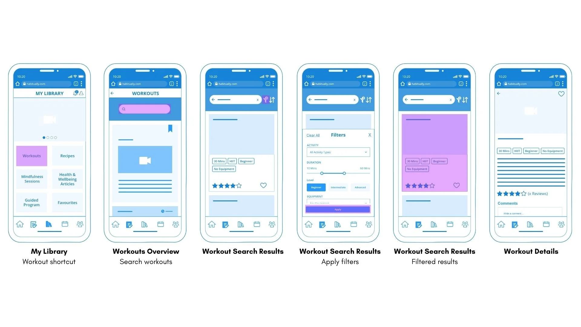
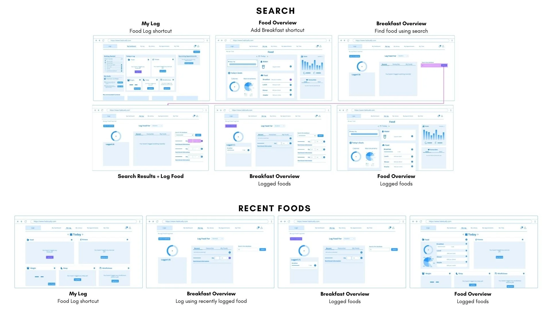
Search Workouts
Find a workout that fits my needs in the moment: From both the interviews and the survey, I found that users struggled with maintaining habits due to changes in schedule. As such, I wanted to provide a way for them to easily find a workout that fit the time and equipment they have as well as their level to reduce this as a barrier.

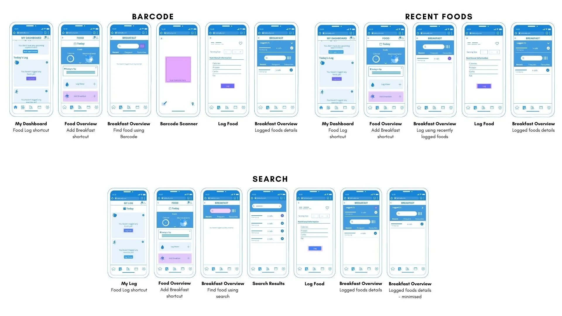
Log Meals
Make it quick & easy: Given a lack of motivation is a key barrier to maintaining healthy habits, I wanted to avoid making logging food too onerous. As such, I decided to provide several ways to log food so that it can cover a variety of situations - Search, previously logged or favourited food and barcode scan (mobile only).
Show impact on goals: To drive home the concept of healthy habits, the app would suggest a target caloric intake and macronutrient profile (which the user can edit) and then show how the logged meals contribute towards that.
Prototype
With the navigation, structure, interaction and functionality mapped out from the low and mid-fidelity wireframes, I could move on to focusing on adding graphics and content and refining the spacing and layout in high-fidelity wireframes. I also refined the flow and put together interactive prototypes for both mobile and desktop.
Key Design Decisions:
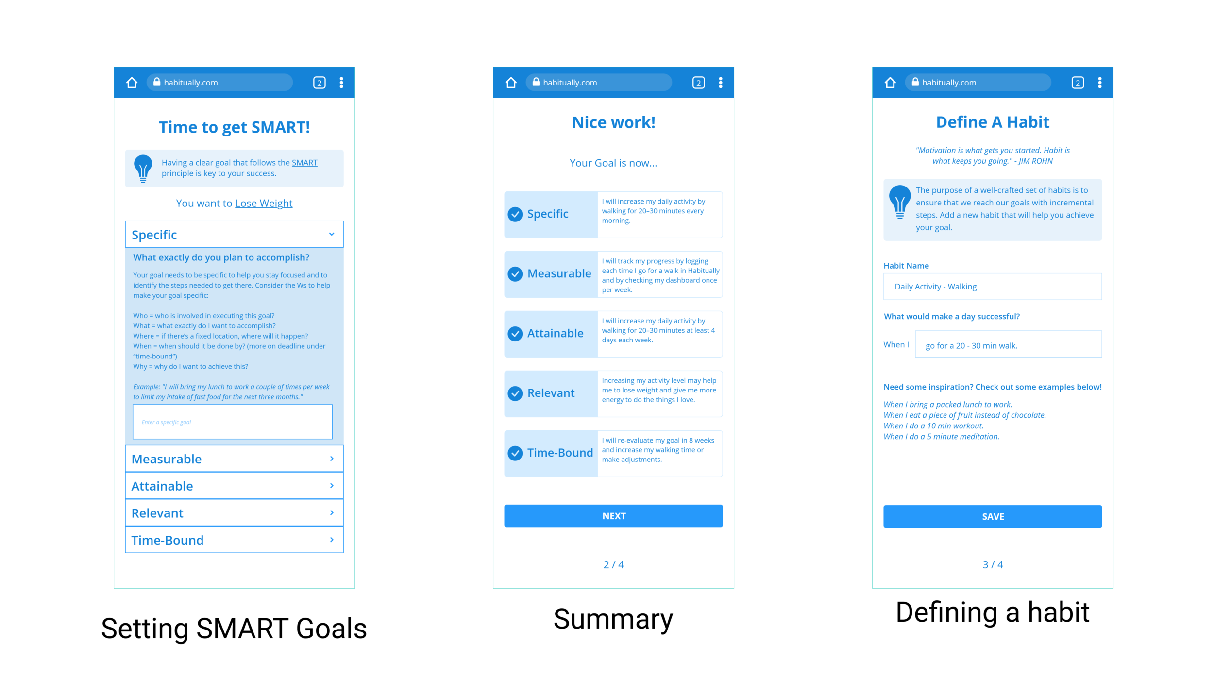
Setting SMART goals: Given that developing healthy habits was the primary goal for my target users, I wanted to provide a framework for selecting the RIGHT habits and to make their goal achievable by guiding the user through SMART goal setting and more defined habits. I spent more time on this in the high-fidelity wireframes, and decided to include this in the onboarding (and at this stage it was not skippable) in order to set the tone for the app and get them focused straight away.
-
Mobile
-

Desktop
Test
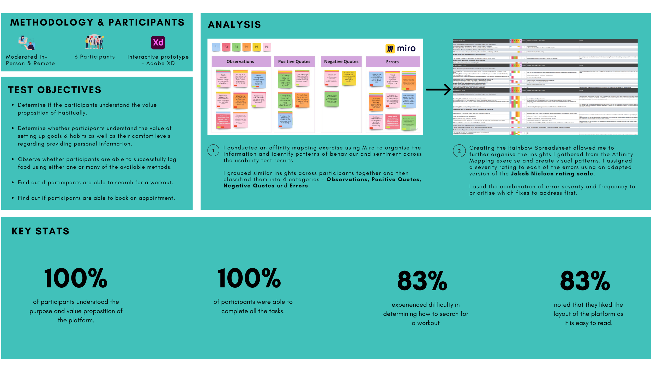
Usability Testing
The goal of this usability test was to determine the learnability for new users interacting with Habitually for the first time on mobile and desktop. I wanted to observe and measure if users understand the platform, its value and how to complete some of the core functionality of the platform such as setting up goals & habits, logging food, searching for a workout and booking an appointment.
Quotes From Usability Testing
Positive
“I like the same as yesterday option because it’s convenient” - Log Food
“I love that everything is on one page” - Dashboard
“I’ve never seen setting goals broken down like this in an app before” - Goals & Habits
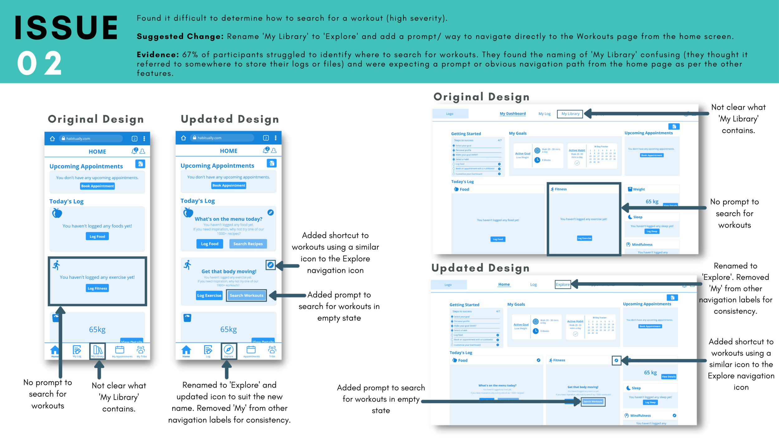
Iterations based on usability test findings (examples)

Refine
Visual Design
For the first iteration of the UI design, I used various visual design principles to ensure the platform is not only visually appealing, but that it also makes it easy for users to navigate and process the content as well as eliciting appropriate emotional responses. I used the following principles when designing the UI:
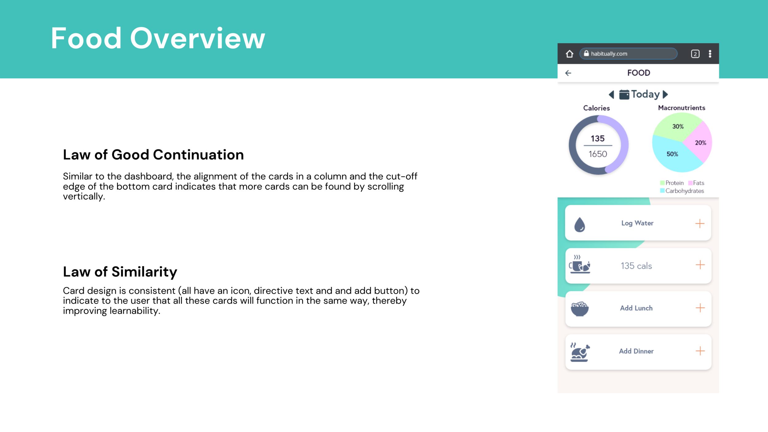
Gestalt Principles (e.g. law of similarity, law of proximity, law of good continuation)
Colour Theory
General principles of design (e.g. unity, balance, hierarchy)


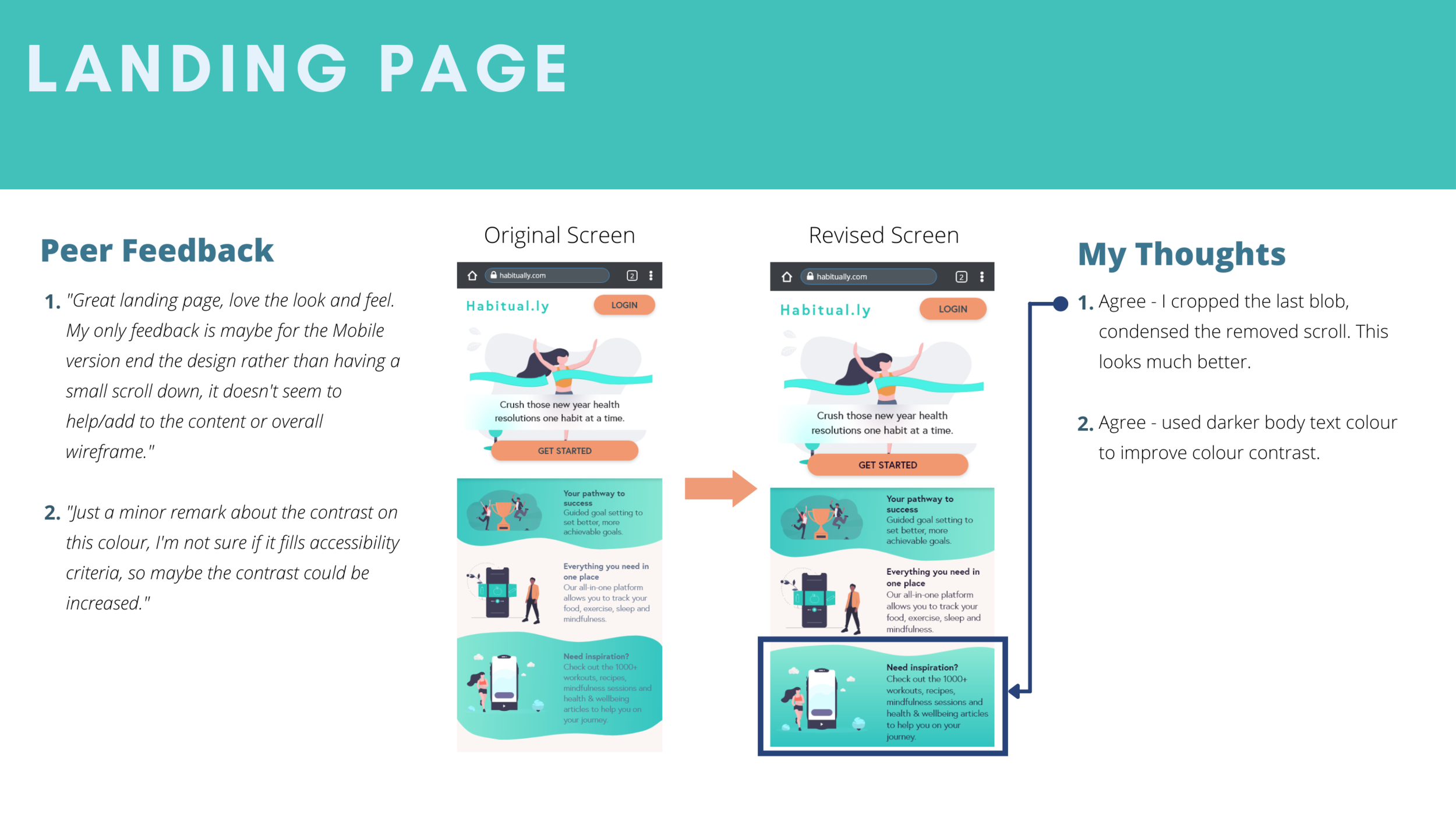
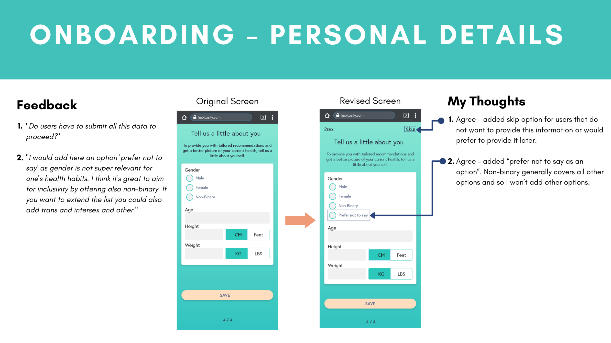
Iterations Based on Peer Feedback
As UX design is a very collaborative discipline that champions an iterative design process, I solicited feedback from 3 of my peers via sharing the high-fidelity prototype I built for Habitual.ly using Adobe XD.
The feedback was positive overall with some very helpful suggestions on how to improve my design. The following provides examples of the feedback I received, my thoughts on the feedback and the iterations I made.

Design Language System
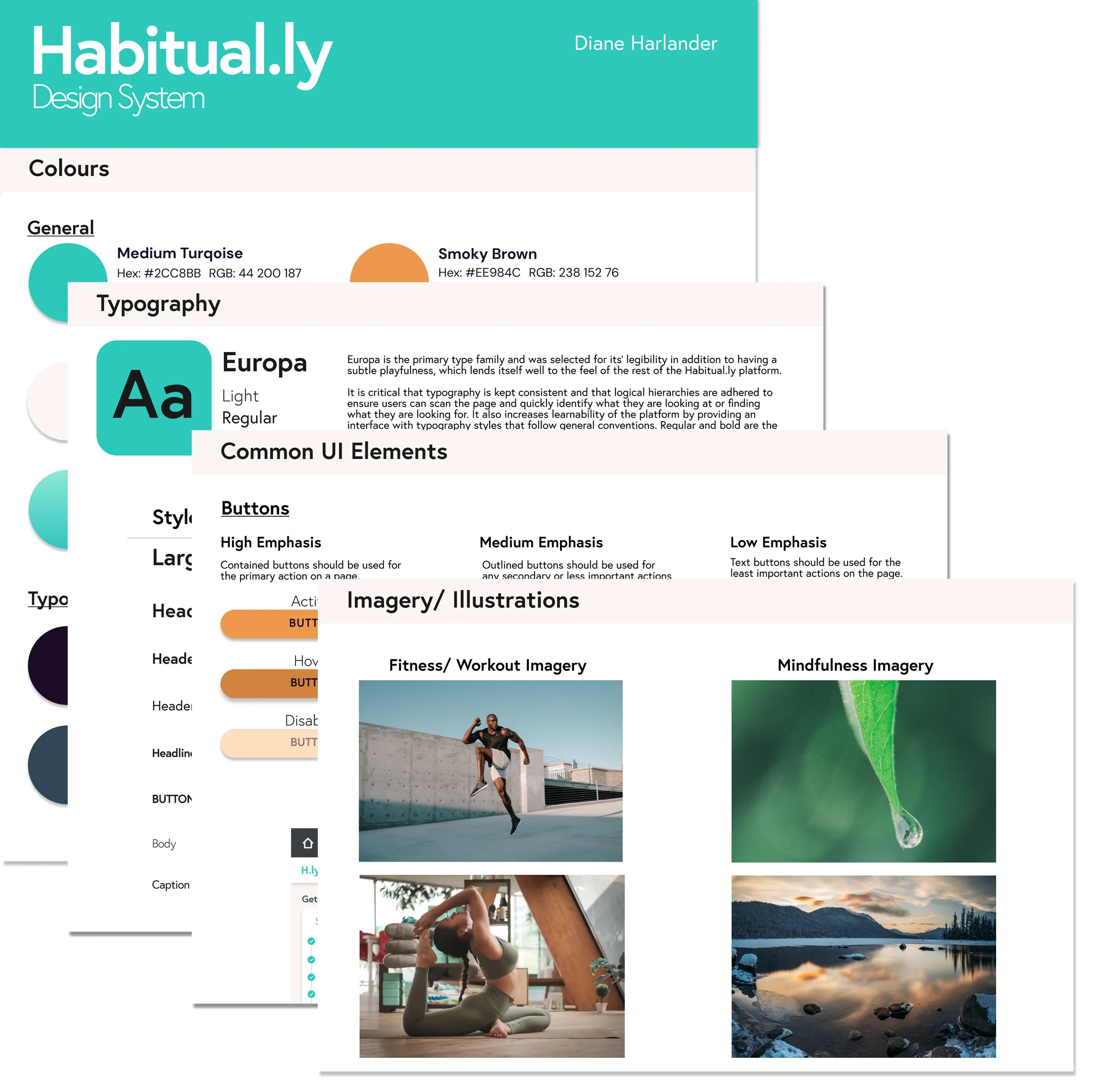
Habitual.ly Design Language System
To ensure consistency in the design and user experience of Habitual.ly, I developed a design language system that covers:
Colour
Typography
Common UI elements
Imagery/ Illustrations
Copy
Grids
Iconography
Accessibility
Final Prototype

Reflection
Overall, I’m happy with how my design turned out - I got a lot positive feedback during usability testing and peer feedback but I also learnt a lot about the design process and intricacies of visual design and responsive design. It was also so much fun to work on something closely aligned with my passion - health & wellbeing!
Learnings
Responsive Web Design
There are a lot of considerations involved in designing for a responsive web application compared to a native mobile app e.g. common patterns, balancing a consistent experience across all screen sizes while also ensuring the content is displayed in the most optimal way for the screen size it’s currently being on, what functionality is available/ supported.
Asking Why
You get better insights when you drill deeper into the ‘why’ - why they think, feel, do or say something.
I work better using digital wireframes
Similar to my last project - Lingua, I found sketching to be very time consuming as I would need to redraw whole screens to play around with the layout. I personally find I am more efficient ideating using digital tools as it’s quicker to iterate on and change things around.
Next Steps
Conduct another round of testing with the visual design & iterations from the first round of usability testing.
Design the ‘Tribe’ functionality for social accountability & gather feedback through usability testing.