
Lingua
Project Overview
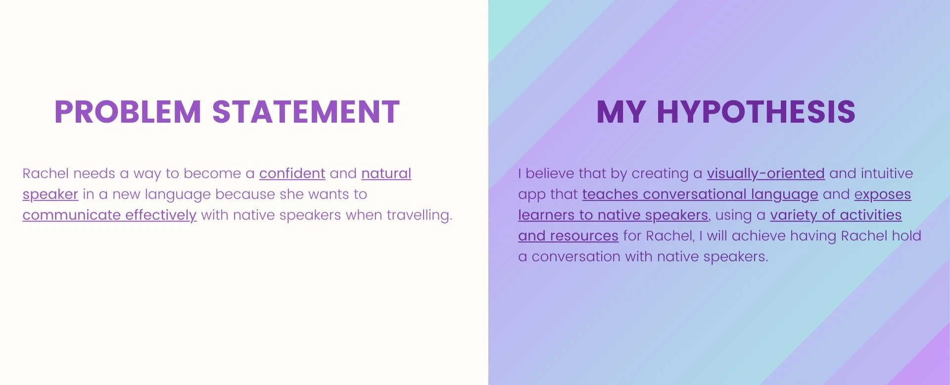
The Challenge
Design a mobile app that empowers people to learn new vocabulary by putting into practice what I had learnt about the design process from Career Foundry’s UX Course.
The Process

The Result
Lingua is a visually-oriented mobile app that teaches conversational language through a variety of writing, speaking and listening activities to make travelling and communicating with native speakers easy.
-
My Role
UX Designer
-
Project Time
1.5 Months
-
Tools
Pen & Paper | Draw.io | Marvel
Understand
Competitive Analysis
Goal
Gain valuable insight into the current language learning app market, paying particular attention to strengths and weaknesses of competitor apps and identify any gaps in the market that I could solve.
Approach
I analysed 3 language learning apps (Memrise, Rosetta Stone, Duolingo), focusing on answering the following questions during my analysis:
How easy is the app to use?
Do the features of the app accomplish the goals of the app and its users?
What could I do better?
Results
-
What Works
Gamification elements make the experience more enjoyable and help with motivation.
Allowing users to customise the learning experience to suit their learning style/ the pace at which they want to learn.
Positive/ encouraging language
Varied activities/ content
Tailoring the vocabulary learnt based on the goals of the user
Adapting the difficulty based on the user’s performance.
-
What Doesn't Work
When gamification elements become more important than the goal of learning a language (e.g. not being able to continue learning if you run out of lives).
Providing too much flexibility/ customisation for beginners as they may get lost. A certain level of structure is needed at the beginning (without becoming too rigid).
Large time commitments.
-
Opportunities
Modifying the experience based on the user’s mastery of the language (i.e. structure vs flexibility)
Gamification elements that do not impede the learning experience.
User Interviews
Goal
Understand the needs, goals and behaviours of people looking to learn a new language. Specifically, I wanted to gain insight into the following:
How have they approached learning a language in the past and how successful was this approach?
What has been the biggest challenge they have encountered when learning a new language?
What are their attitudes towards using a smartphone to learn a new language?
Approach
I conducted in-person interviews with 3 people that have attempted to learn a new language in the last 12 months and are interested in trying again in the future.
Results

Words and phrases being taught in most language learning apps are not actually useful when speaking with native speakers due to slang and different dialects.
Creating visual associations are key to successfully remembering vocabulary.
“I enjoy learning languages when I can apply what I've learnt straight away in my daily life.”
They feel frustrated when they come back to learning after taking a break and there’s no quick way to revise or no indication of where they are up to.
“I feel less motivated to learn a language when it doesn't immediately benefit me or when I'm not really learning for a purpose.”
They need to be able to do learning in bite sized pieces to fit it in to their busy lives.
Learnings & Challenges
When analysing the data after the interviews, I often found myself forgetting to dig deeper regarding the ‘why’ - Why do they do this? Why do they think this? Why do they feel this?
Define
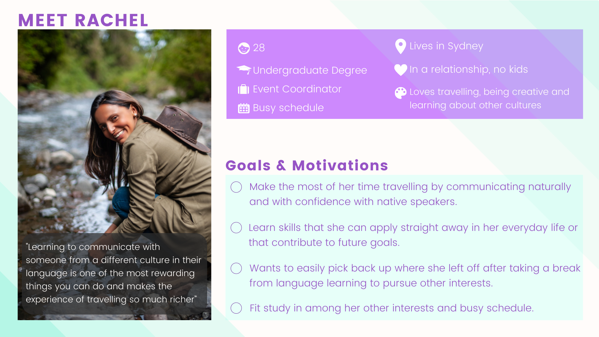
User Persona
Goal
Consolidate the insights gained from the interviews into a believable/ real persona that would help me generate empathy for Lingua’s target users. This will help me to better prioritise their needs when making design decisions.
Approach
Using what I learnt from the user interviews, I constructed a proto-persona. I chose to create a single proto-persona given my limited data and the similarities in the responses/ overall themes.
User & Job Stories
Goal
Translate human needs into functional requests for features that will inform the rest of the design and development process.
Approach
Using the proto-persona I created, I put myself in Rachel’s shoes to determine what features are required to help her achieve her goals. I created both user and job stories to experiment with which format I found more useful.
Results
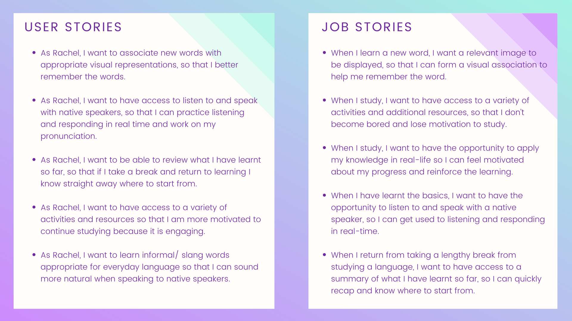
As a result of writing the user & job stories, I settled on the following key features that I would need to include in the design to meet Rachel’s needs and goals:
Visually oriented learning activities
Access to a variety of activities and the ability to select the ones she likes the best
Learning summary & review
Practice speaking skills with native speakers
Learnings
I found job stories to be more useful that user stories as they focus on causality, which in turn provides more context and focuses on motivation instead of just implementation.
Ideate
Task Analysis & User Flow
Goal
Identify the screens/ pages in addition to the flow between the screens/ pages to build for Lingua that would help Rachel achieve her goal of learning a new language.
Approach
Using the user stories as a starting point, I proceeded to walk myself through all of the individual steps needed to complete the objective to determine the task flow. With task flows completed for each objective, I could then visualise not only the linear path but also any possible deviations or alternate paths Rachel could take while navigating through the platform to achieve her goal, using user flows.
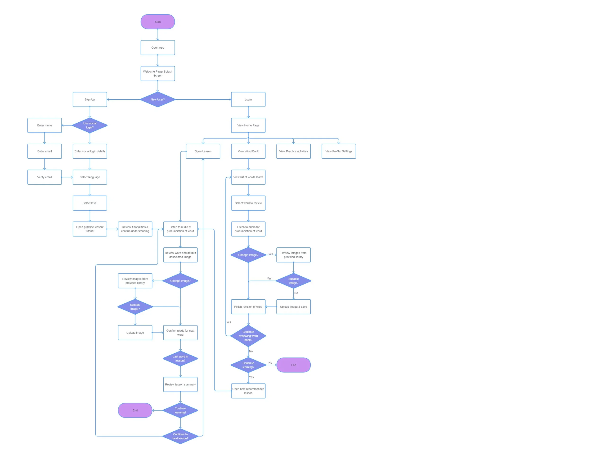
I mapped out the tasks and flow for the 4 main tasks:
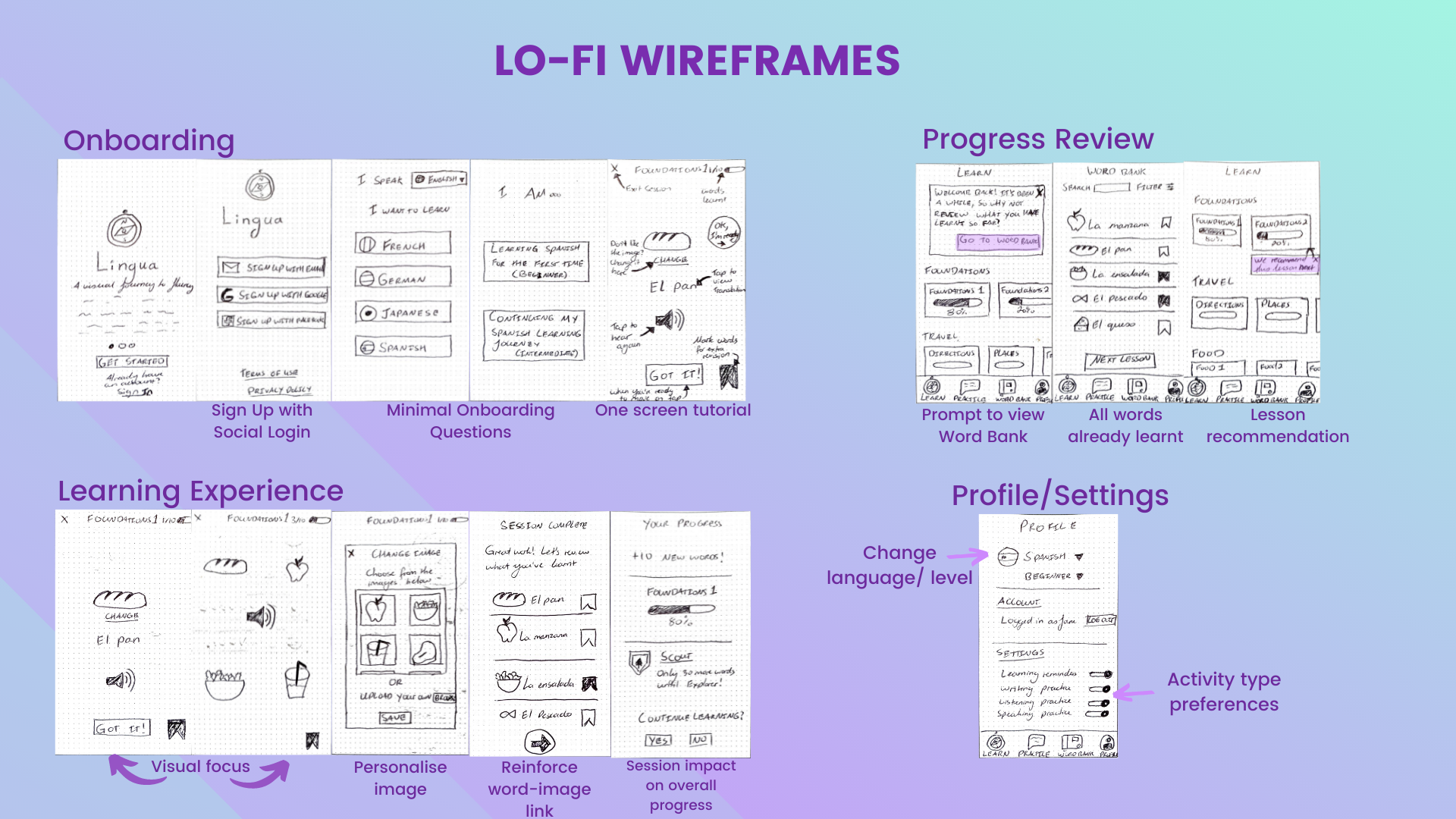
Onboarding
Personalising a flashcard image
Learning summary & review
Selecting activity preferences
And then combined all flows into a single flow to look at the entire experience.
Prototype
Wireframes
Goal
Identify the screens/ pages in addition to the flow between the screens/ pages to build for Lingua that would help Rachel achieve her goal of learning a new language.
Approach
Using the user stories as a starting point, I proceeded to walk myself through all of the individual steps needed to complete the objective to determine the task flow. With task flows completed for each objective, I could then visualise not only the linear path but also any possible deviations or alternate paths Rachel could take while navigating through the platform to achieve her goal, using user flows.
Prototypes
Goal
Create a clickable prototype that could be used to gather early feedback on the features and overall flow of the design.
Approach
I used Marvel to create clickable prototypes of my lo-fi wireframes.

Test
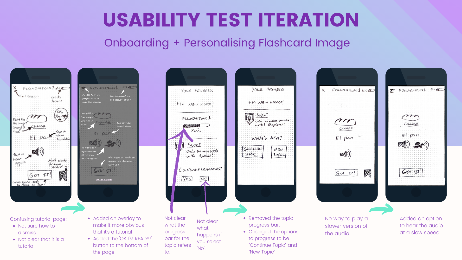
Usability Tests
Goal
Identify the screens/ pages in addition to the flow between the screens/ pages to build for Lingua that would help Rachel achieve her goal of learning a new language.
Approach
Sessions: I ran 10 minute in-person and remote usability tests with 3 participants.
Scope: I tested the following 3 flows:
Onboarding
Customising flashcard image
Word Review
Setting activity type preferences
Tools: Marvel was used to turn the paper sketches into clickable prototypes.
Analysis: I created a Usability Test Report and used the Jakob Nielsen severity rating scale to rank issues found which would help me prioritise which issues to address first.
Results
-
#1 Tutorial (Severity 4)
"It's not clear what I should click to dismiss the tutorial"
Not immediately clear that it is a tutorial page
Recommended Solution
Rework the display of the tutorial - wording used in the tutorial and the placement of buttons is not clear in terms of how to progress/ dismiss the tutorial.
-
#2 Continue Learning (Severity 3)
Path for 'Continue Learning' options could be improved - not clear what happens if you select 'No'.
Recommended Solution
Change options to be "Continue Topic" or "Choose a New Topic".
"Continue Topic" would immediately start a new session for the same topic.
"Choose a New Topic" would take the user to the home screen where they can select a new topic.
-
#3 Word Bank (Severity 3)
Not clear how you can practice the words again from the Word Bank screen.
Recommended Solution
Add a visual indicator (either an icon or text) to this screen to indicate that the user can open the word and practice it again.
-
#4 Module Recommendation (Severity 3)
Not clear how the app determines which module to recommend after completing a review of words learnt via the Word Bank. More likely to use the feature if it's clear how the recommendation is determined.
Recommended Solution
On the Word Bank screen, replace the "Next lesson" button with a button that will launch a quick test. The results of the test will then determine which lesson is recommended next.
-
#5 Activity Preferences - During Session (Severity 3)
There's no way to set preferences for the types of activities to be used in a session while you're in a session so you can't modify your practice based on your current environment.
Recommended Solution
Add a settings menu to the activity screen with the options to turn off certain types of activities for a specific length of time.
-
#6 Activity Preferences - Settings (Severity 3)
There's no way to exclude a certain activity type for a set amount of time from the Settings section of the profile page - you can only turn them on or off.
Recommended Solution
Add ability to set a specific length of time for certain activities to be skipped in the settings section of the profile page.
Iteration
Goal
Implement the recommended solutions for the top issues identified during usability testing through iterations.
Approach
While I predominantly redrew some of the screens, for the tutorial page I needed to digitally edit the screens to represent the tutorial overlay as it is hard to do with pen and paper.

Reflection
What I Learnt
What Went Well
Job stories are very useful for providing context and focusing on the 'why' - I think I will make more use of them in the future.
Asking participants to ‘Think out loud’ during the usability tests resulted in great insights.
Task scenarios are a great way to understand how users would intuitively use the app.
Thinking about the ‘why’ behind an action or something that was said helps synthesize user research and get deeper insights.
Asking for stories is better than asking for answers.
What Didn’t Go Well
Jumping straight to creating a revised prototype for all issues identified during usability testing instead of determining whether some instead require further research/ investigation.
Sketching is very time consuming and difficult to iterate on as you have to redraw the screens.
Next Steps
Conduct another round of testing with revised prototypes.
Add designs for how to present the informal and formal version of words/ phrases.
Add designs for other types of activities.
Add designs for the ‘Practice’ page.
Conduct testing for the new screens.